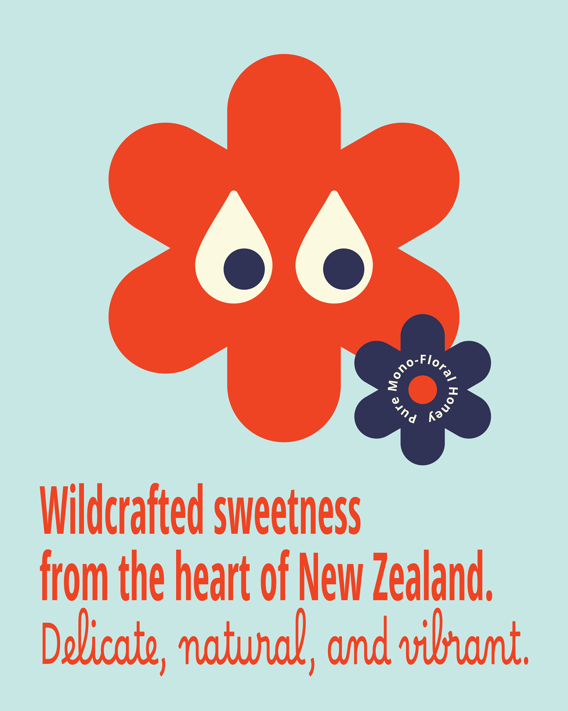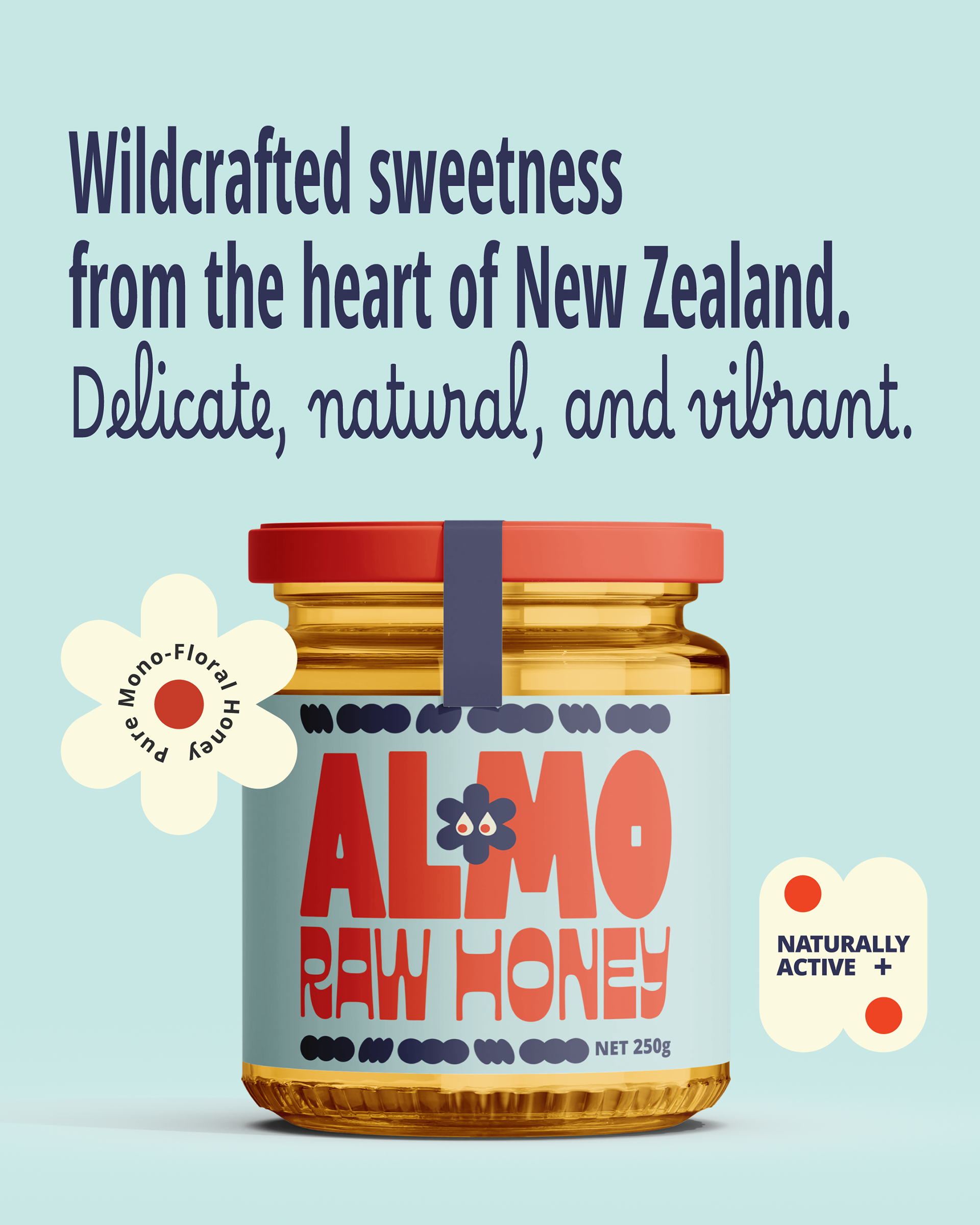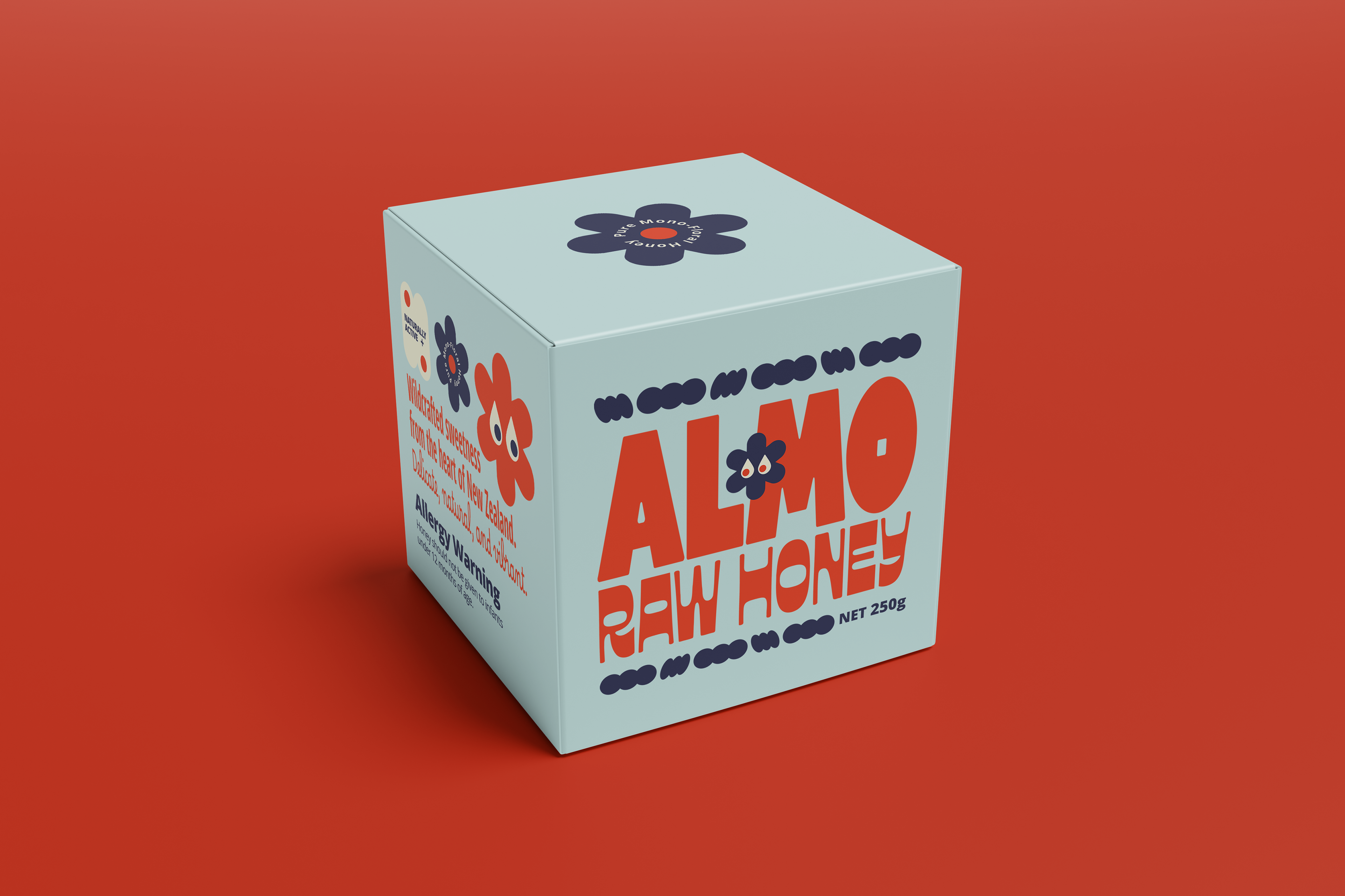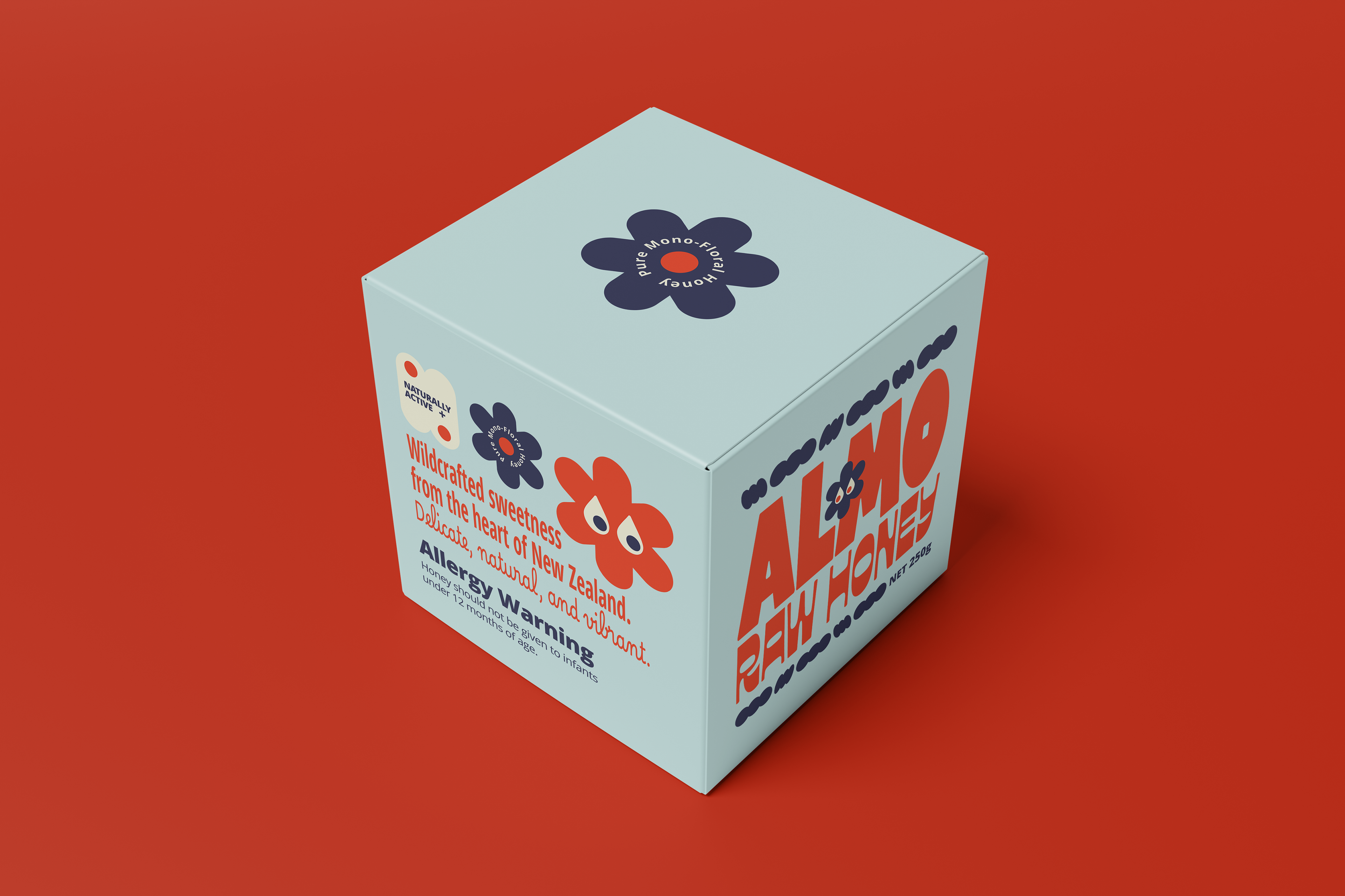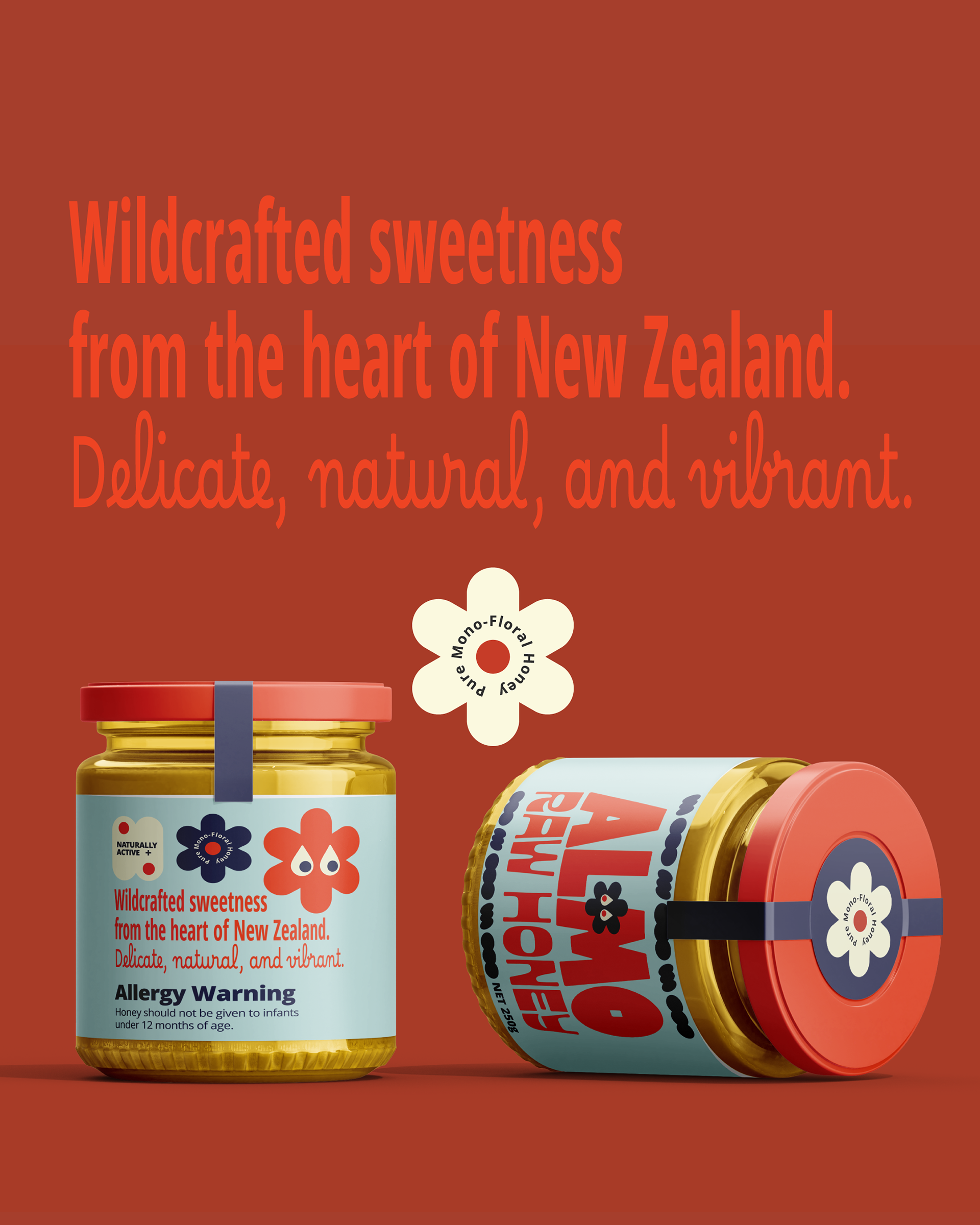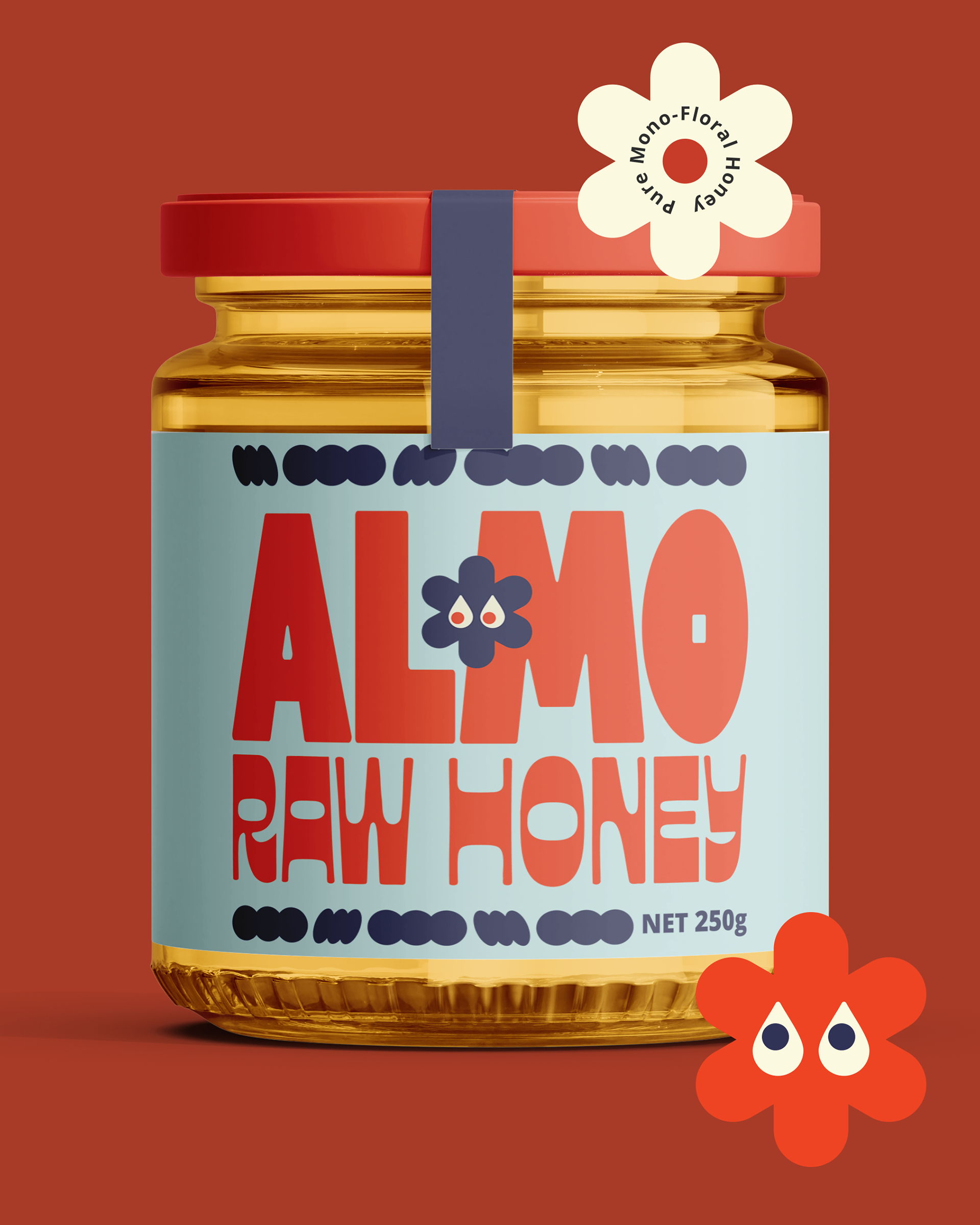
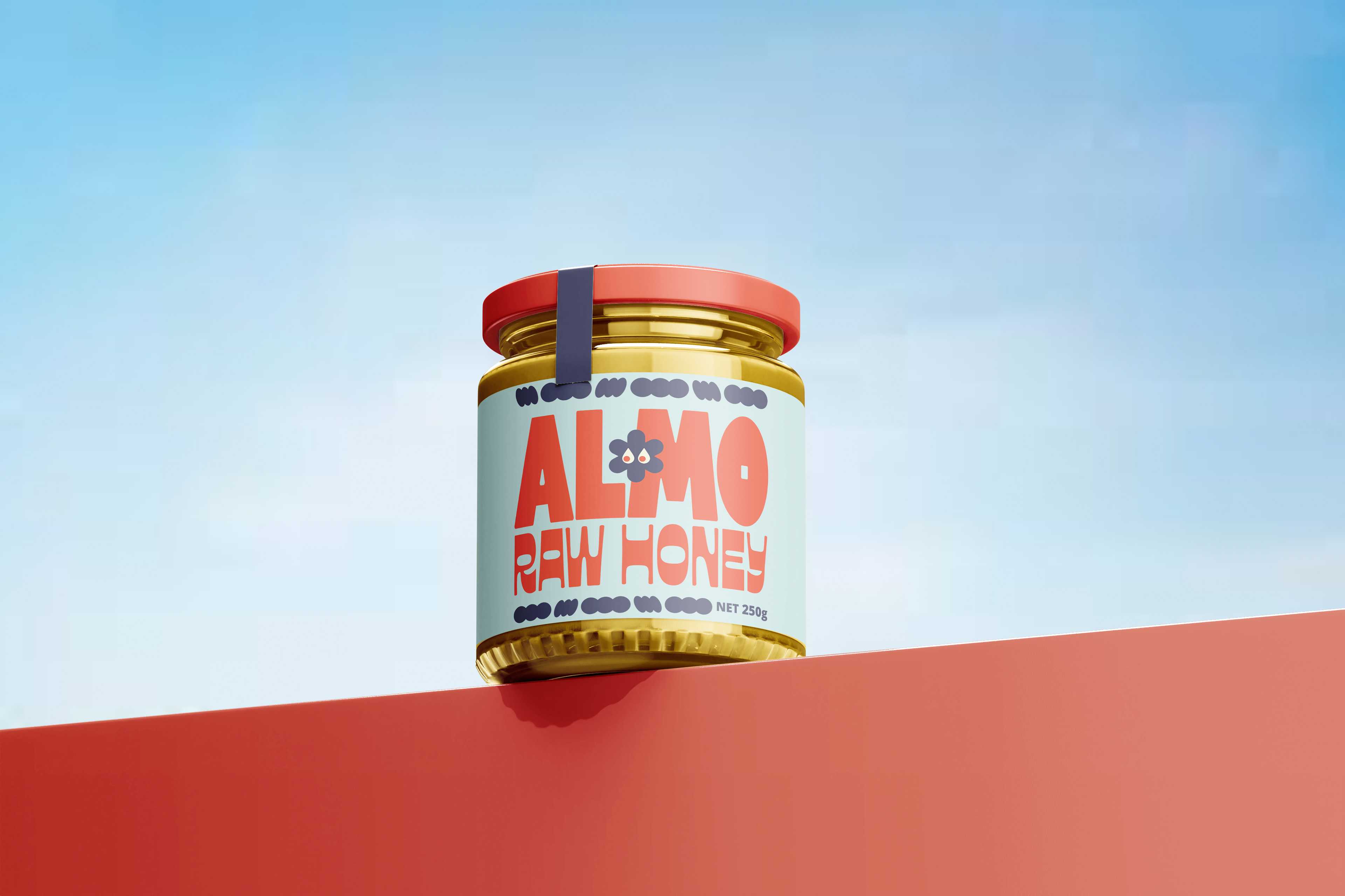
This packaging uses a bold, retro-pop approach to stand out. I avoided the traditional honey look, opting instead for a vibrant, high-contrast palette and playful typography. The abstracted floral icons and mascot give the brand a unique personality and appeal to a modern consumer. This design strategy positions ALMO as a distinct, lifestyle-focused product, guaranteeing visibility on the shelf and creating strong brand recall.