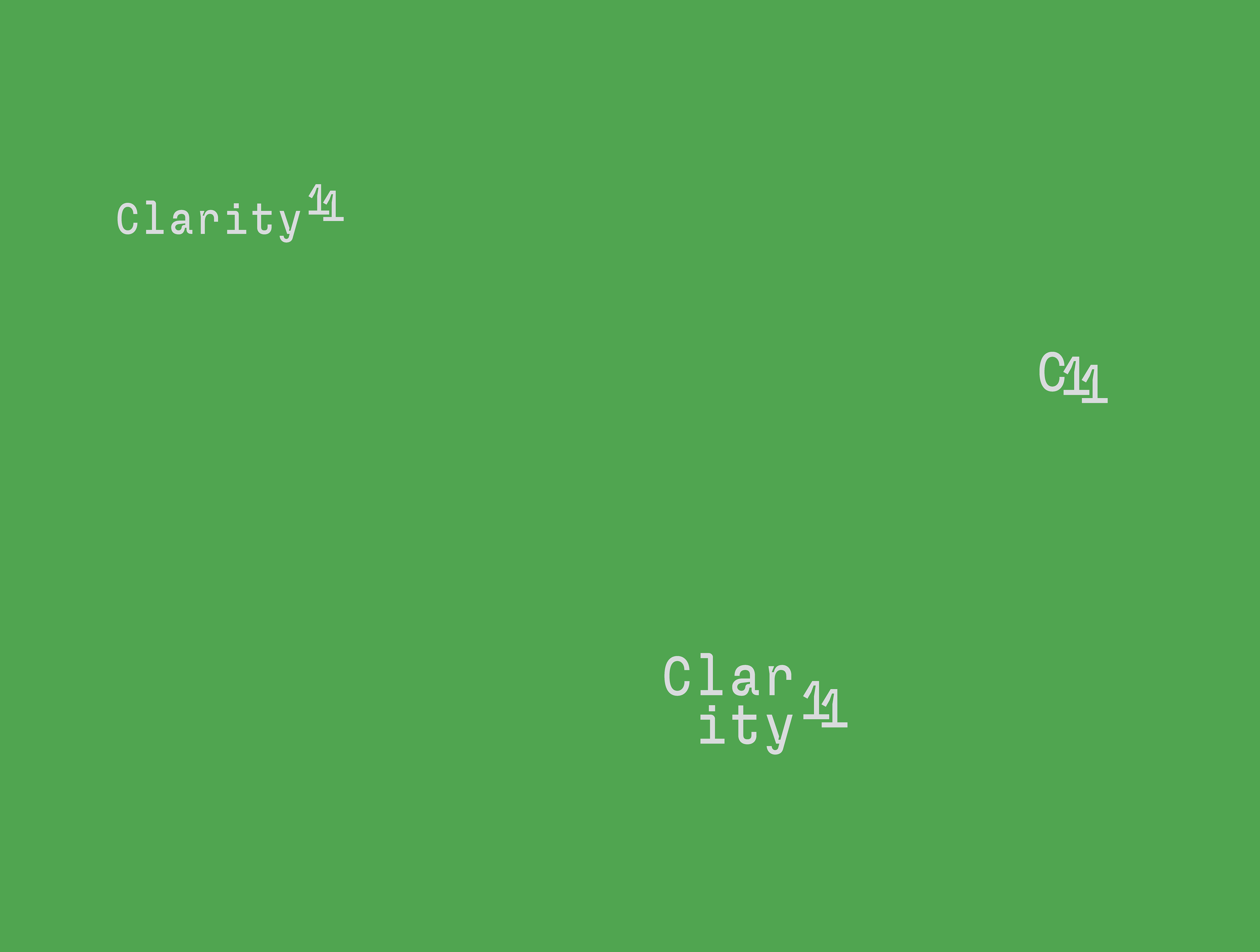
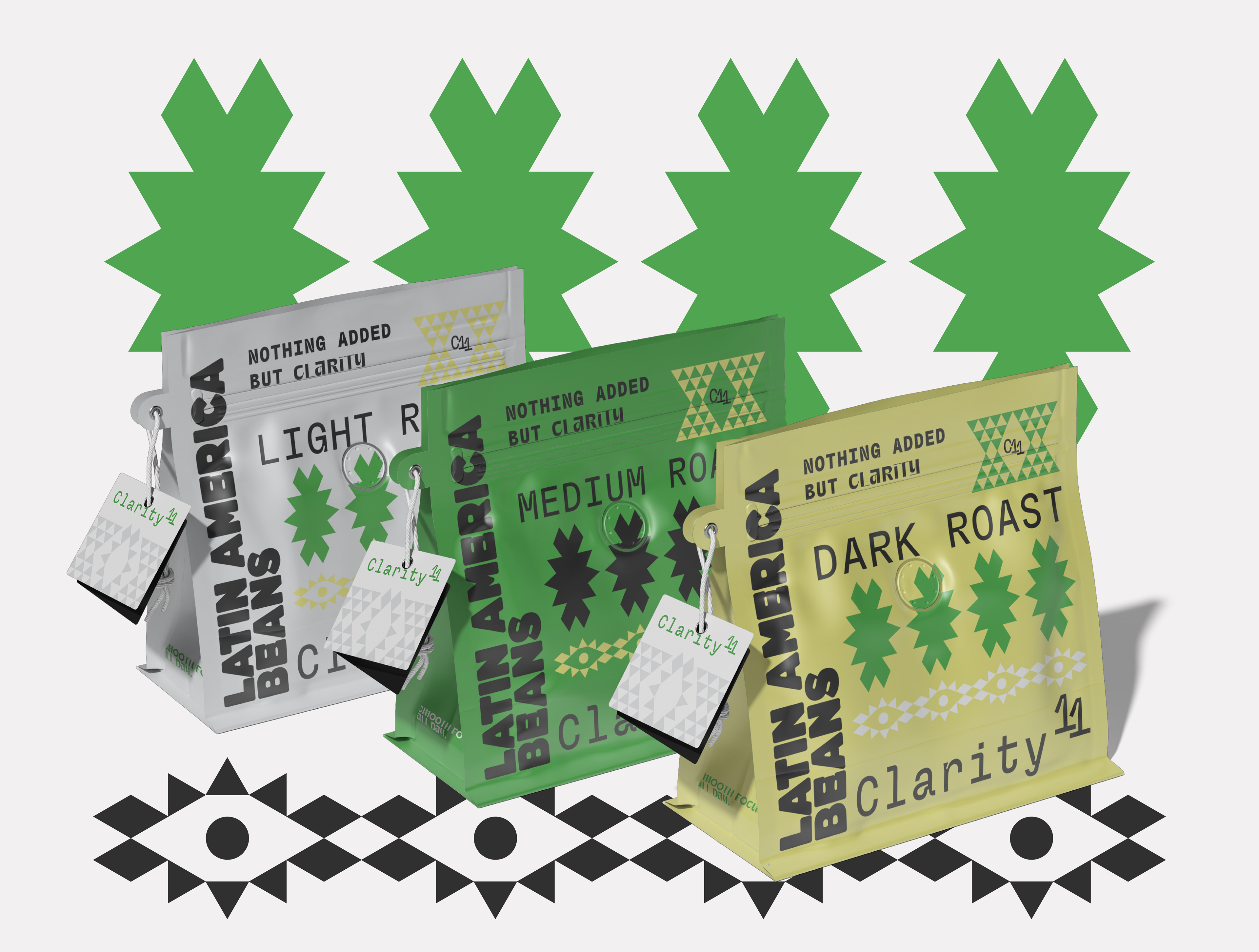
Project: Clarity 11
Scope: Brand identity creation
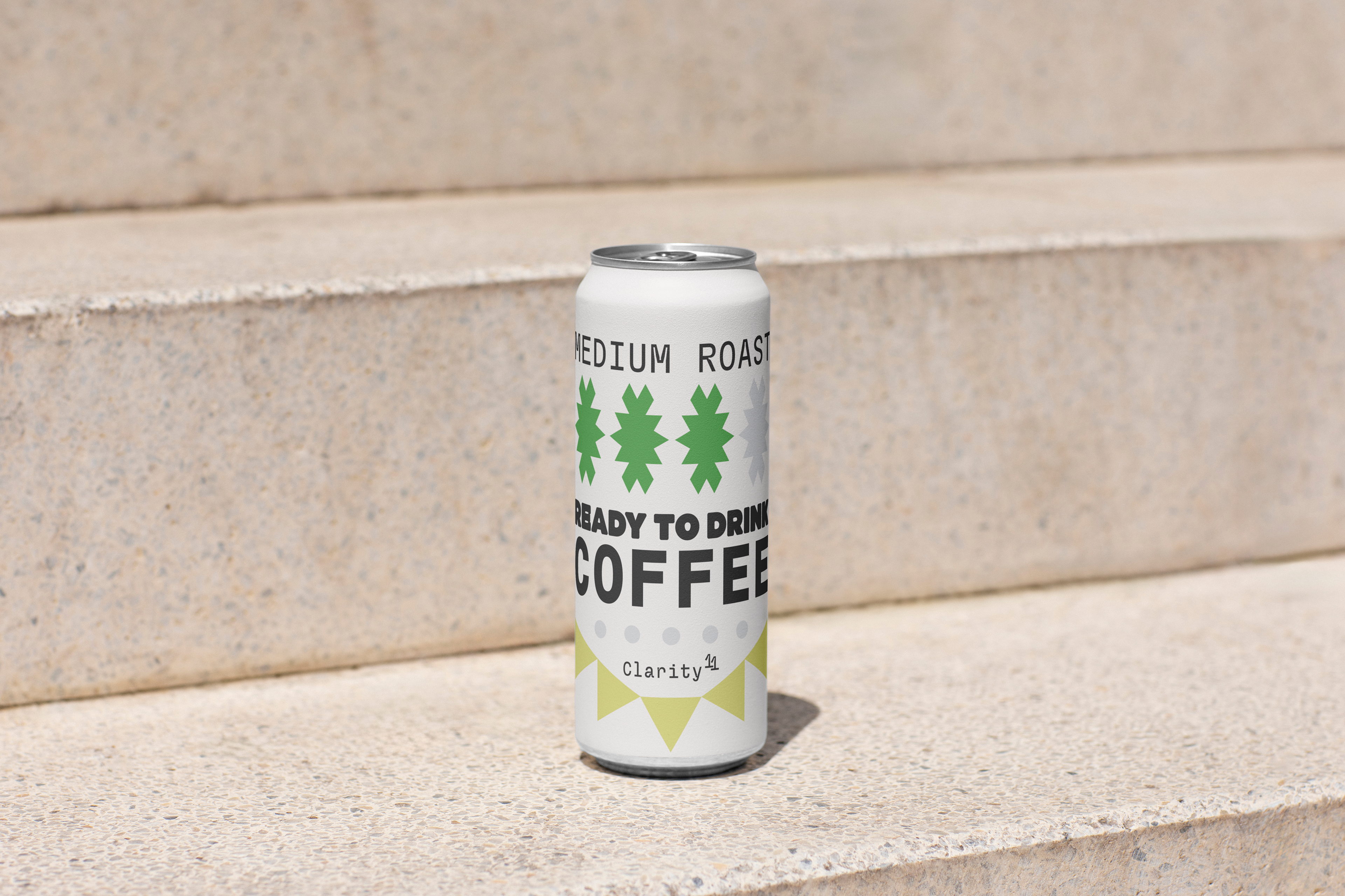
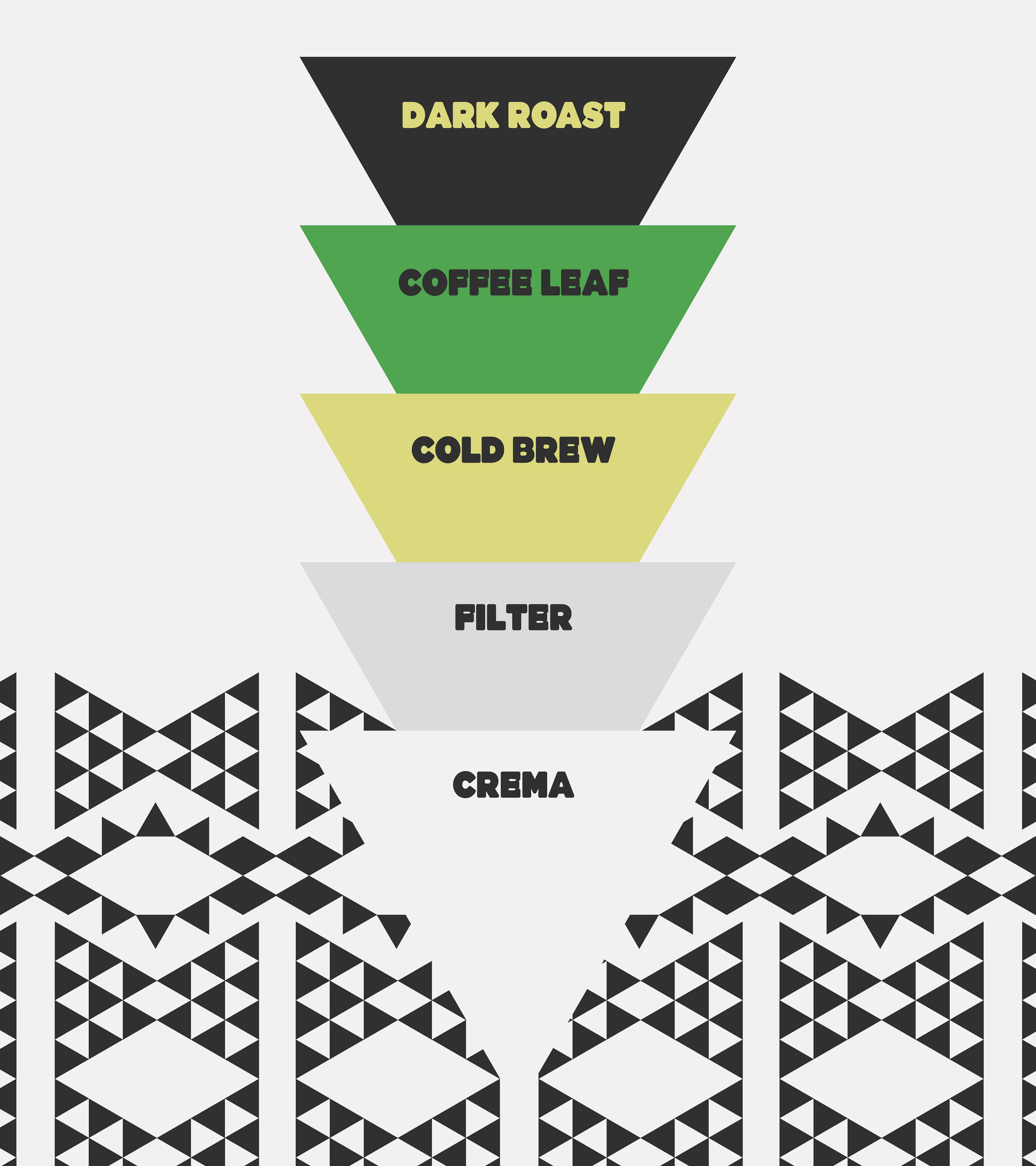
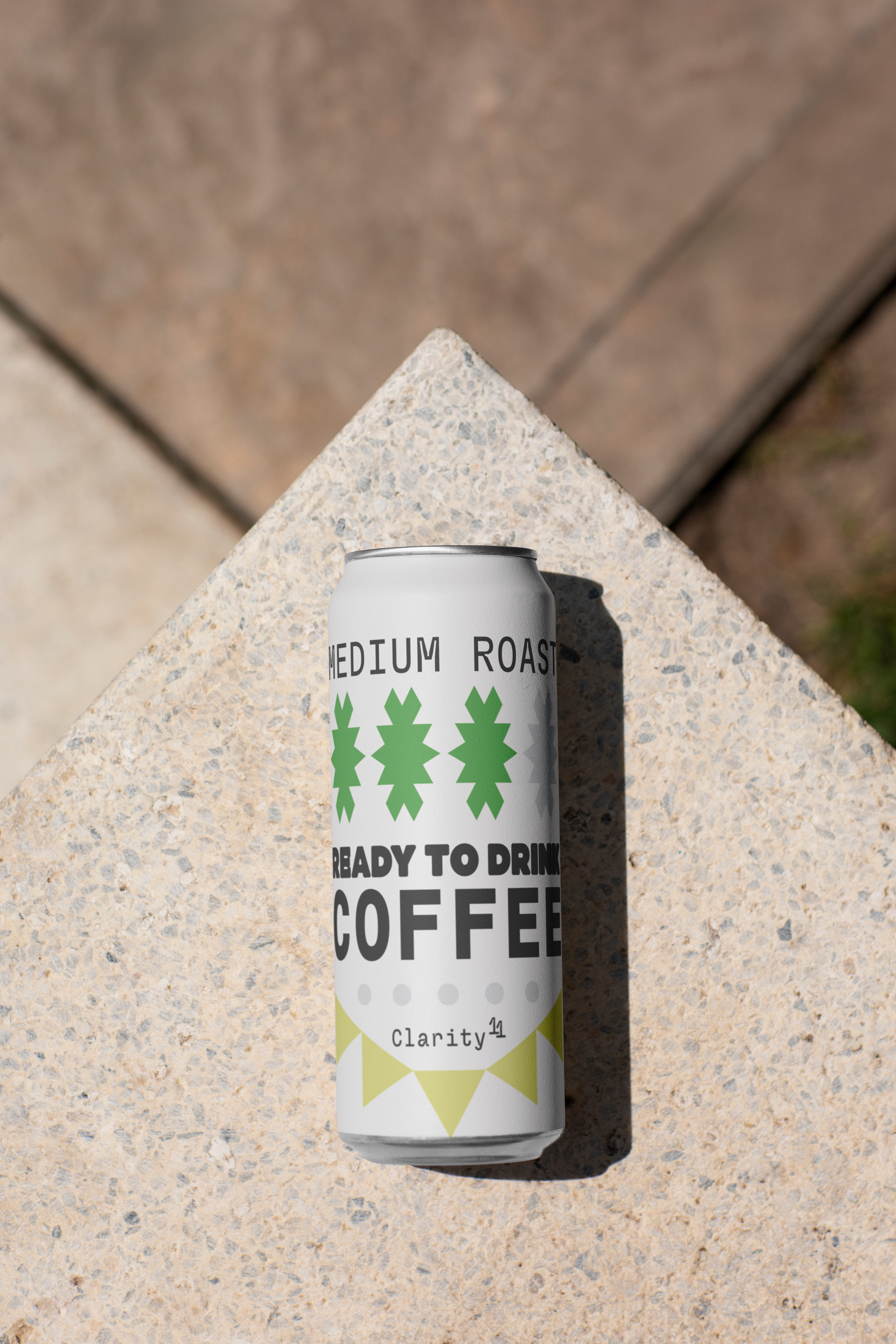
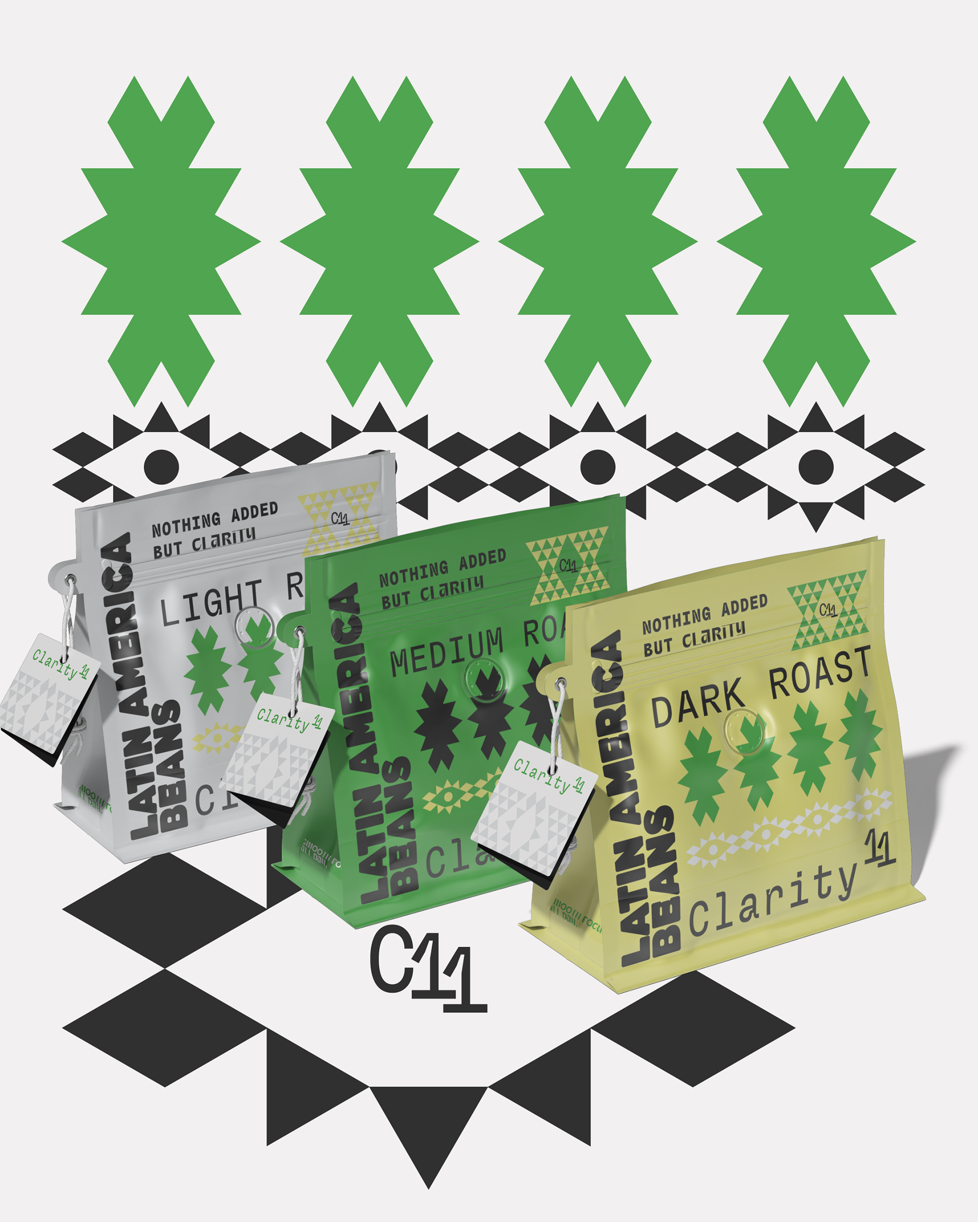
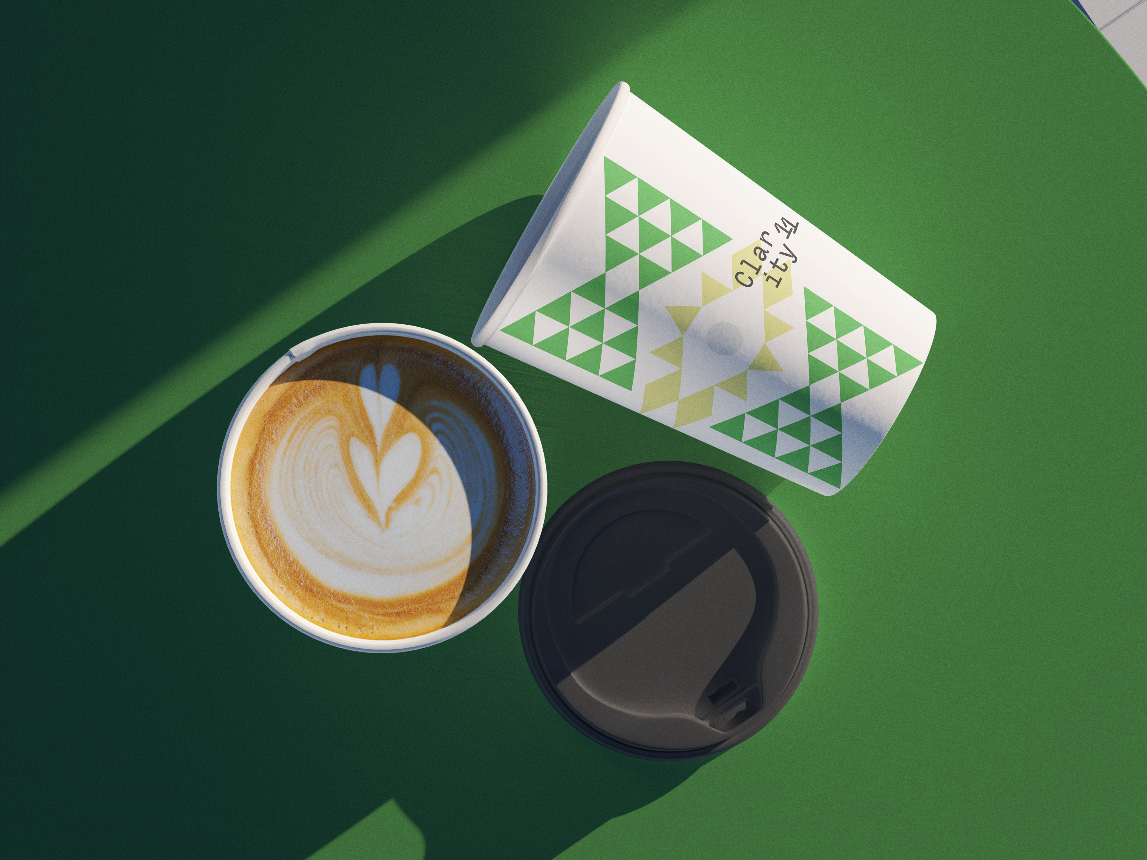
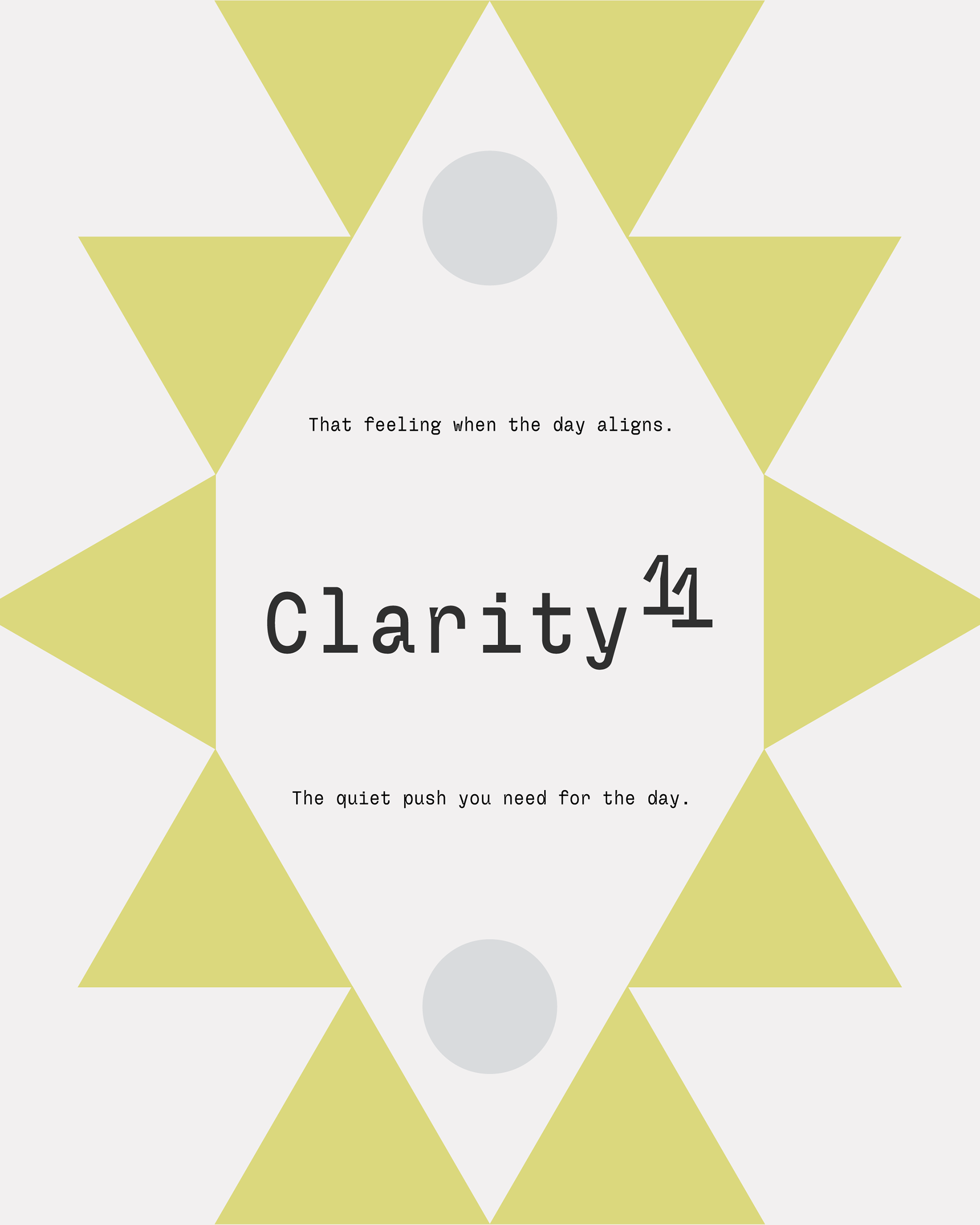
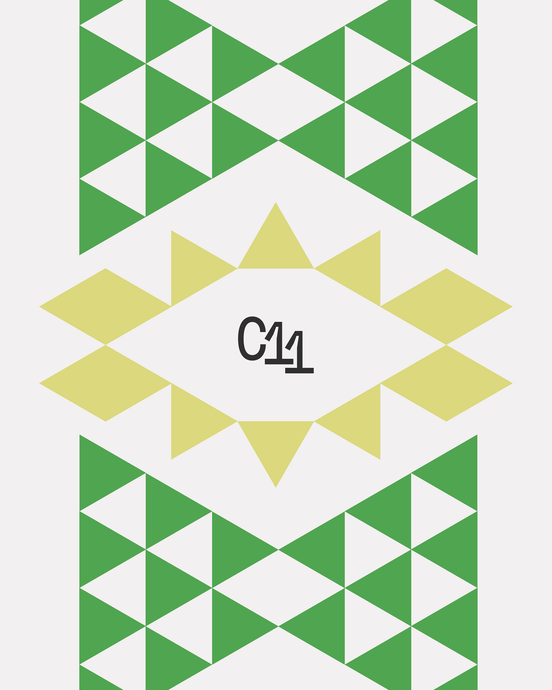
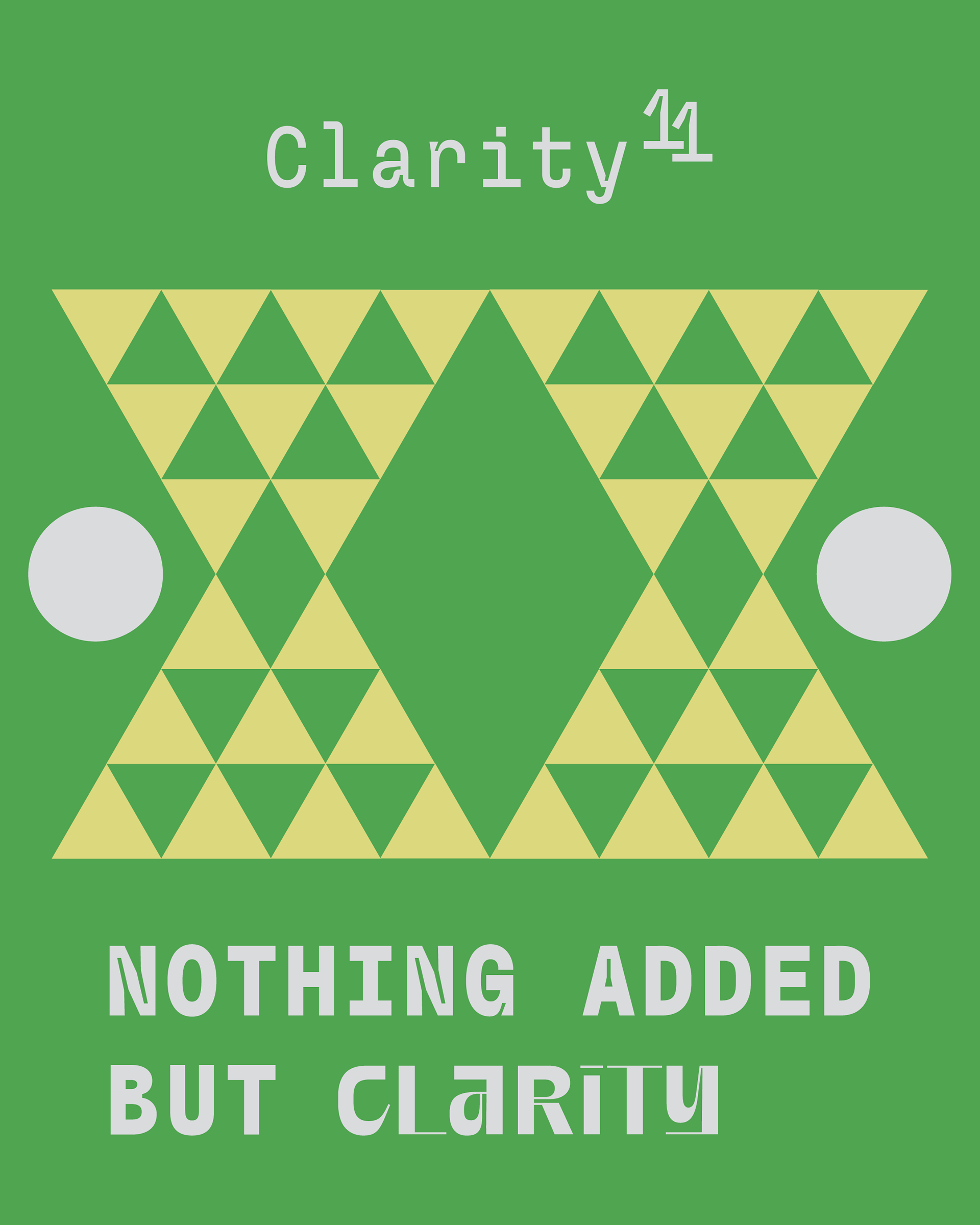
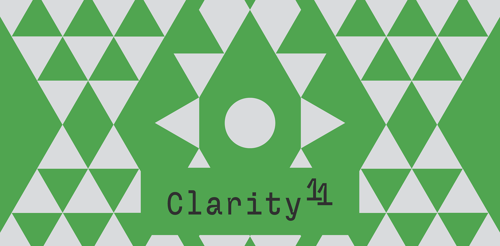
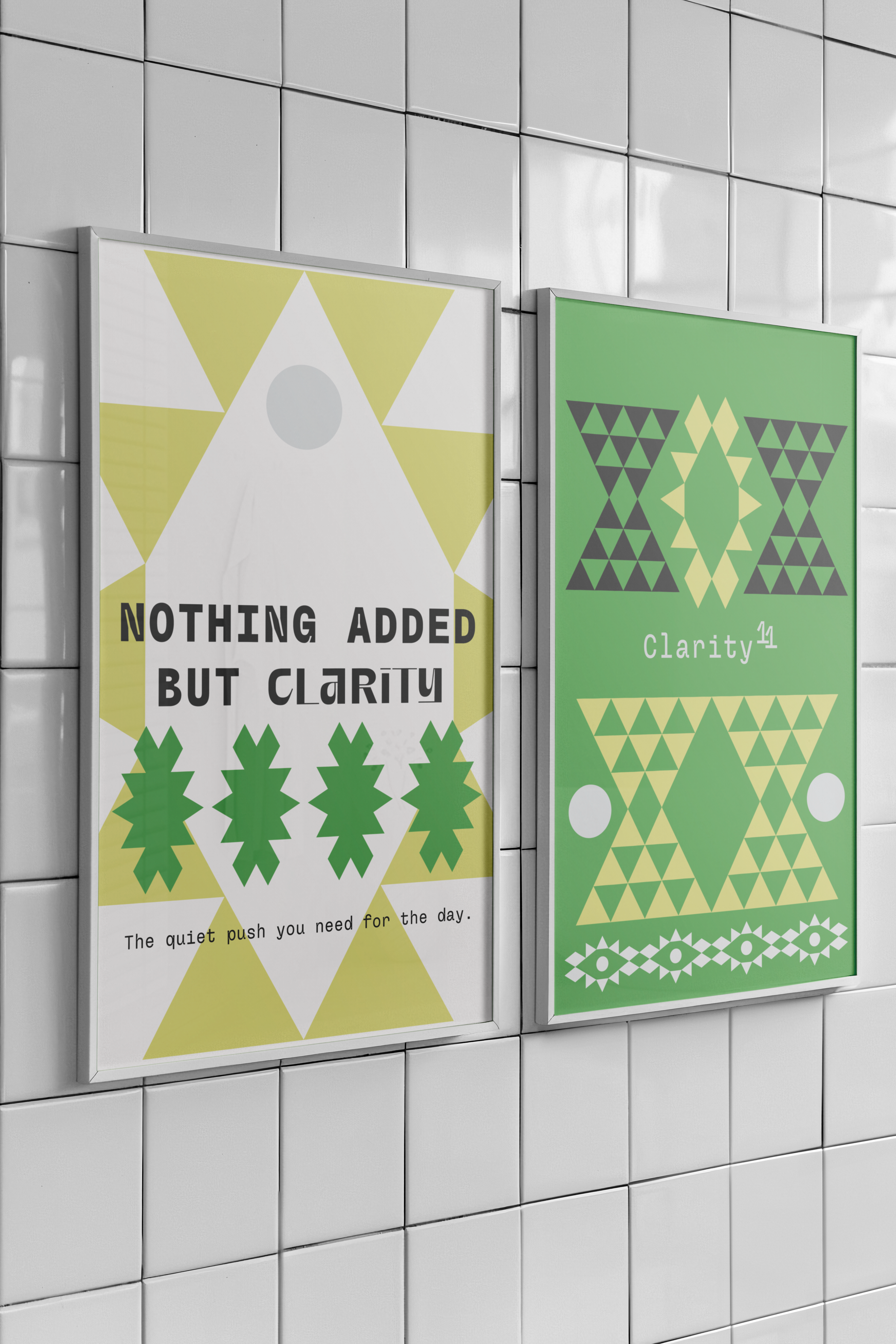
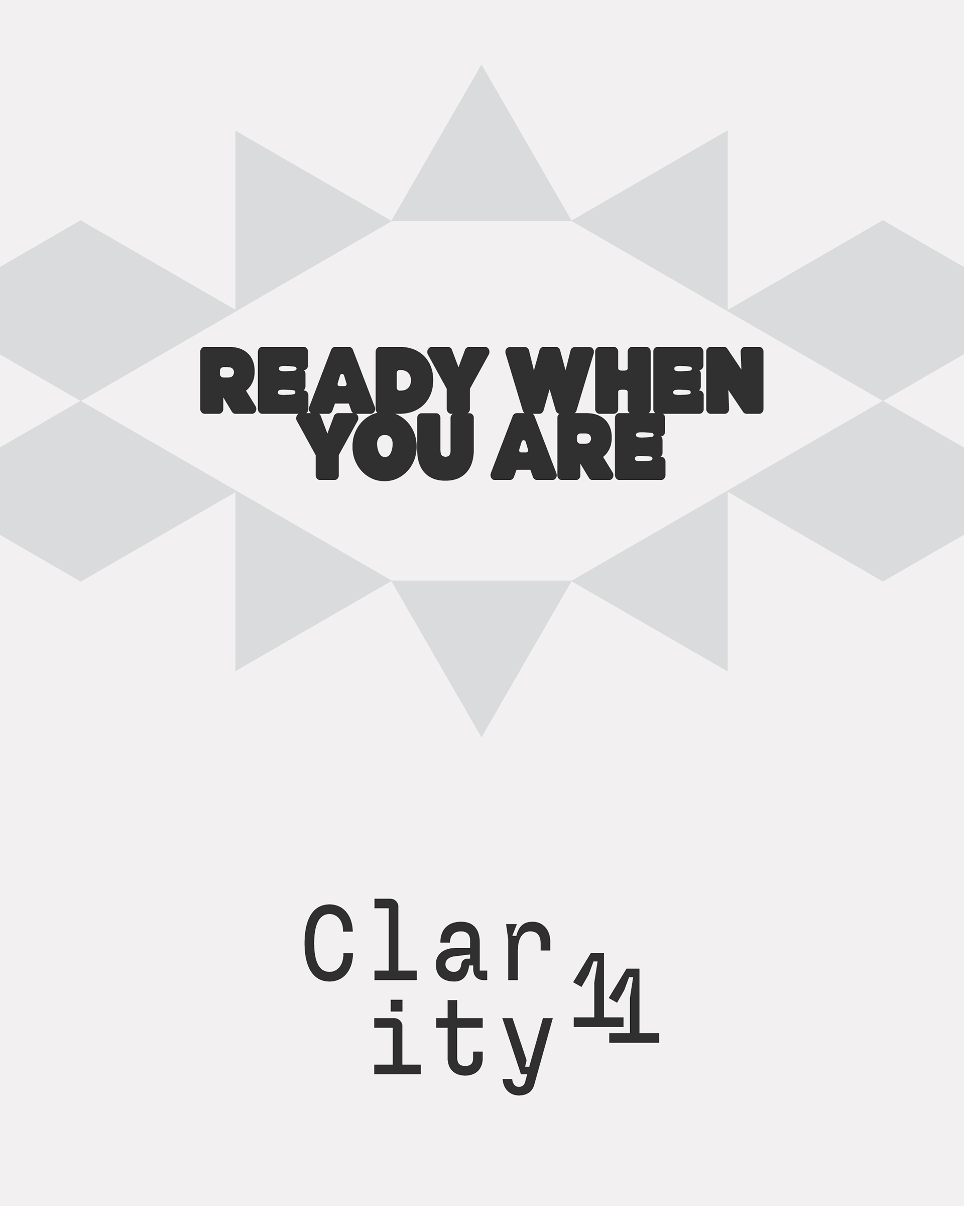
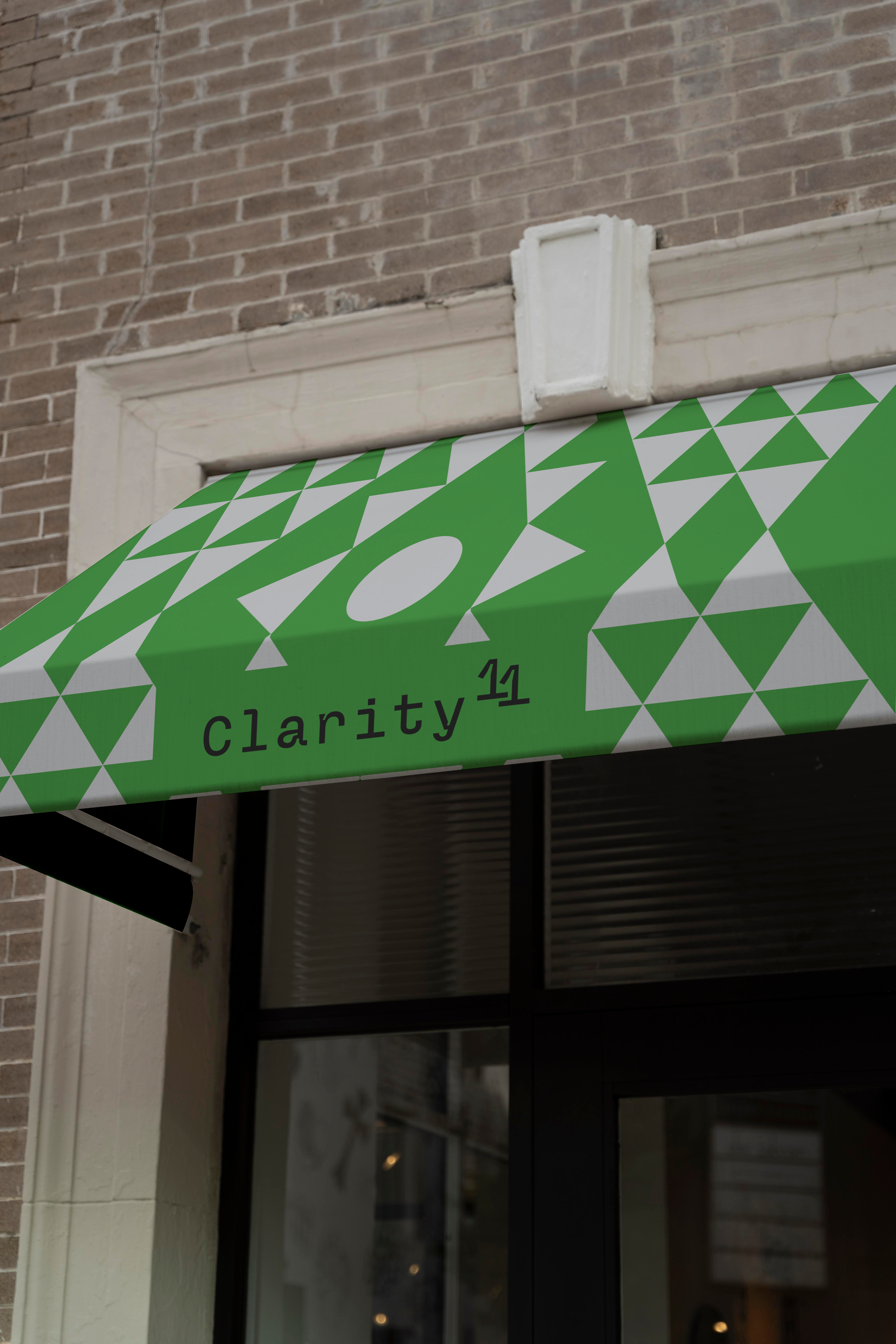
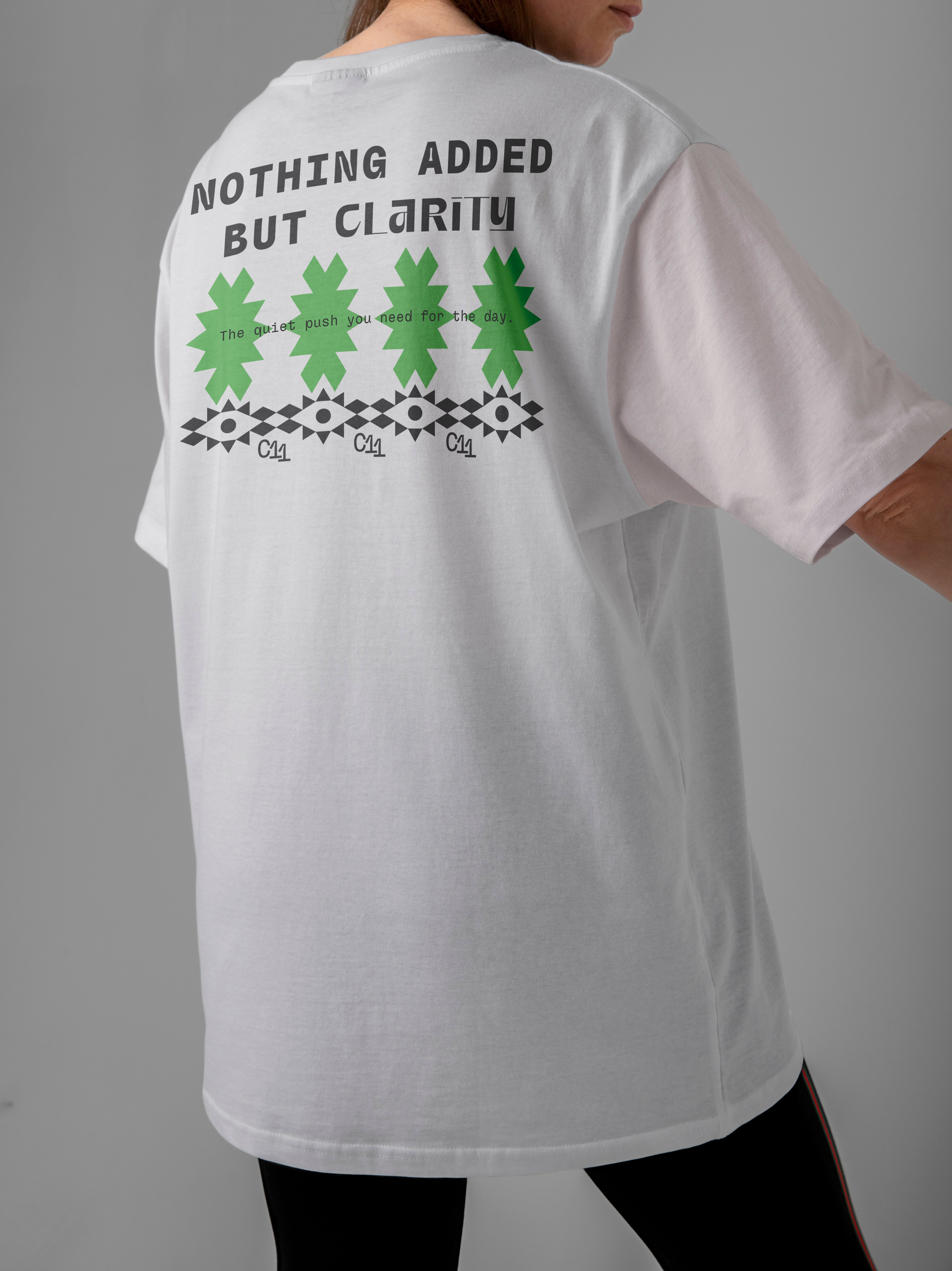
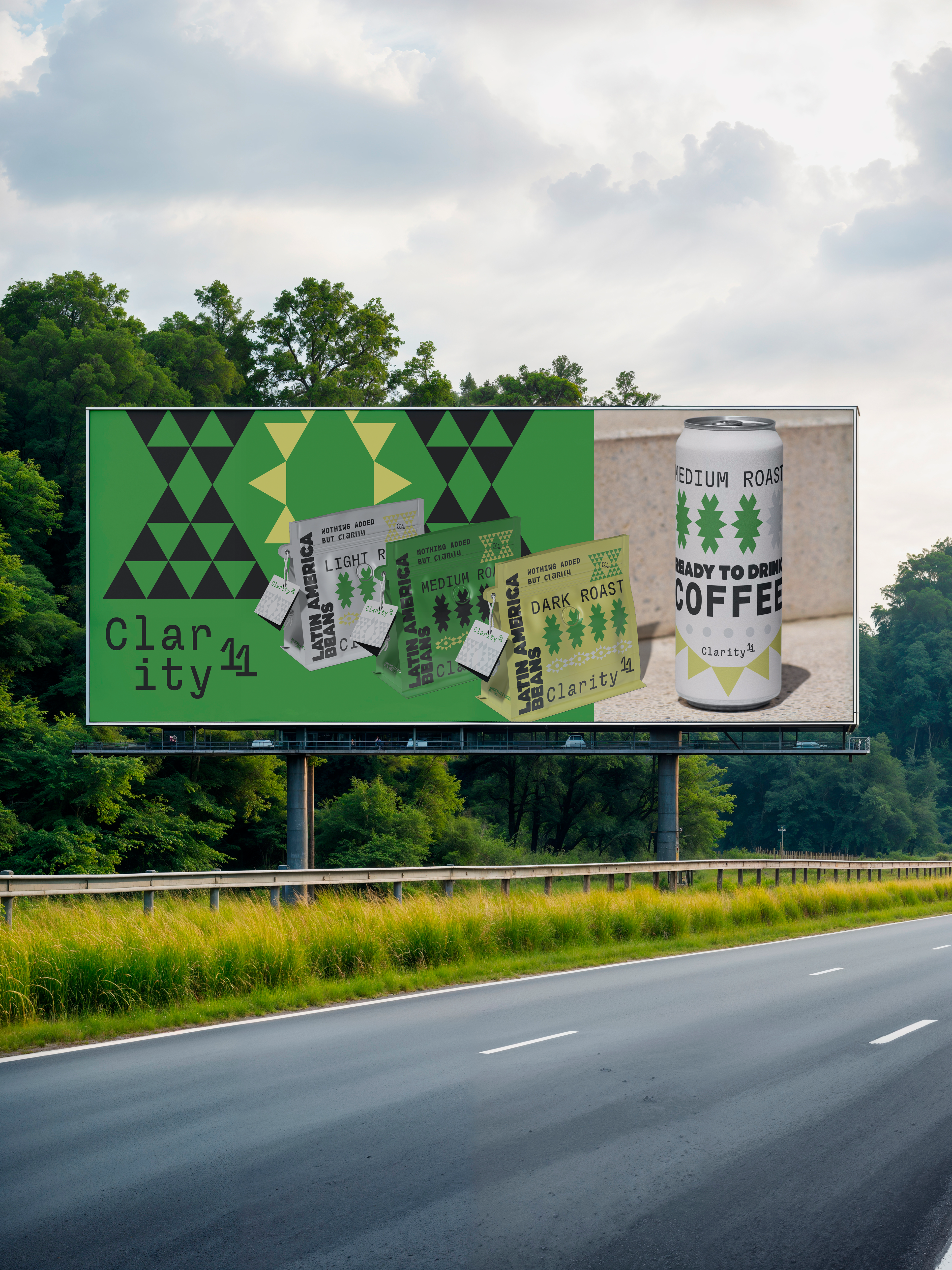
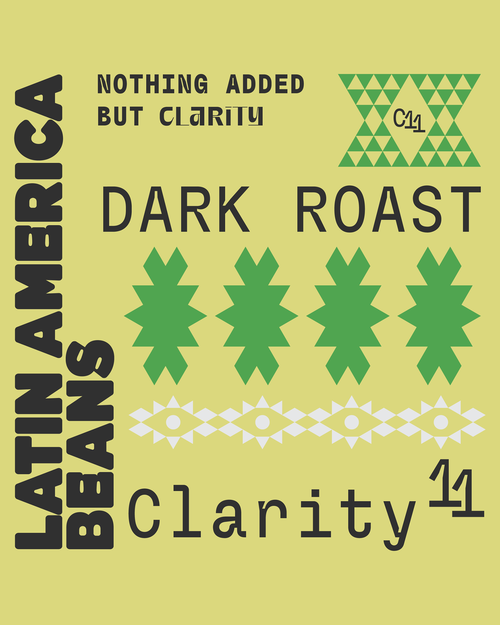
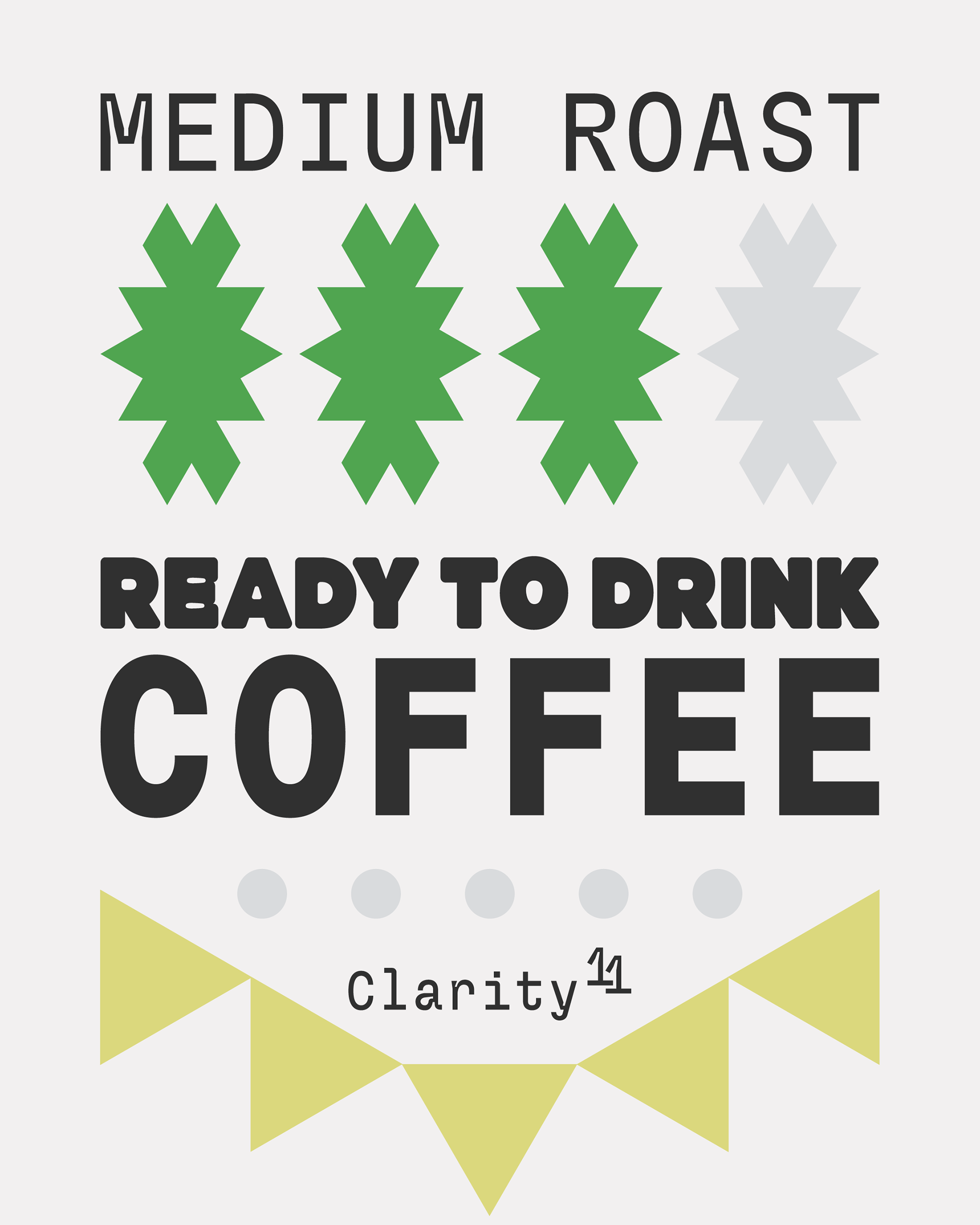
The goal was to create a distinctive visual language that is both modern and memorable. This was achieved through a geometric logo and pattern system, inspired by the precision and balance of a perfect pour, using a fresh palette of green, yellow, light gray, black and white.

This visual foundation was applied across all brand elements, ensuring every touchpoint communicates the core value: smooth, focused clarity. The result is a premium look for their beans, ready-to-drink cans, and coffee cups.